

DIN for Germany/Czechia. Distributed by Microsoft as Bahnschrift.
Ahh a fellow Czech road nerd
Edit: you’ll like this - this was the old pre-2001 font (I’ve forgotten the name tho)
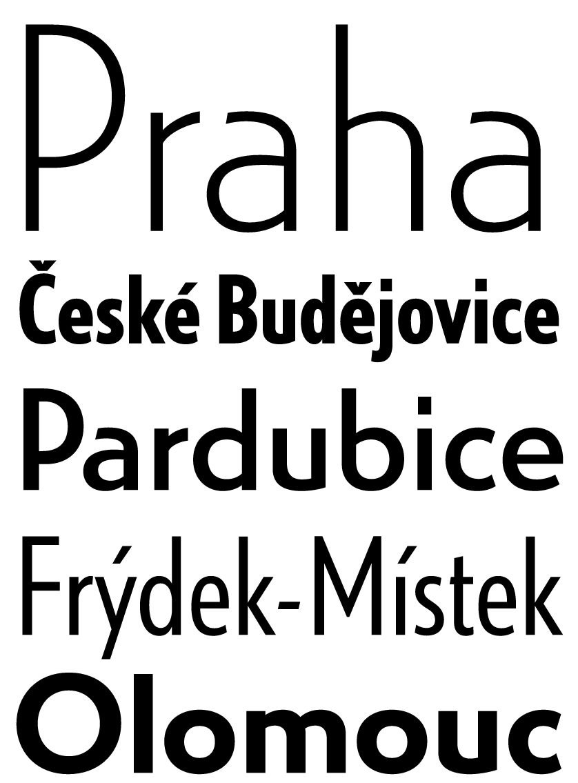
Universal Grotesk. Still in use in Slovakia.
What is your opinion on lowercase/uppercase and closest/farthest at the top?
Also I don’t really like Grotesk as a transport typeface, it’s too bold+curvy…
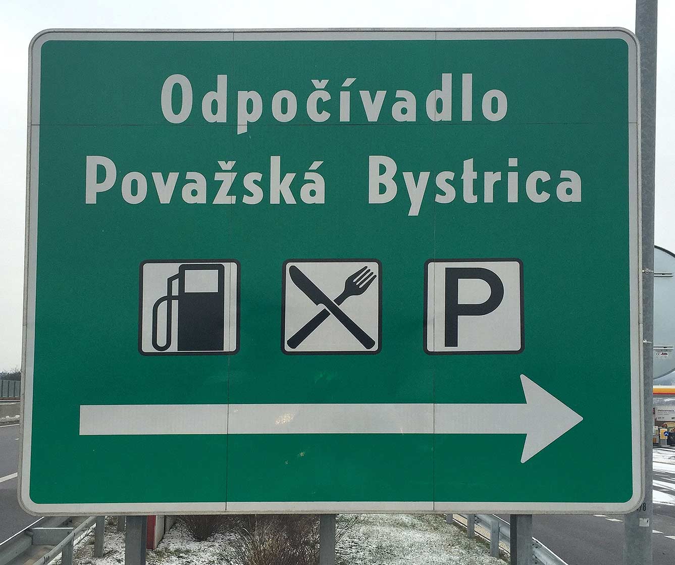
The kerning on the “Od” there feels too loose to me.
I think it would be alright in uppercase. The problem is that lowercase height is barely above half of uppercase, as opposed to most display fonts.
I personally prefer lowercase as it makes the names less uniform in shape therefore better recognisable. I don’t have an opinion on the second one though. Also btw I have a feeling the Slovaks now use the Austrian font
What do u think about the British font?
In terms of British transport fonts, nothing beats Johnston but that already has its place on the Tube. This one is a good silver medalist.
Johnson feels very British
Found it one Wikipedia for Germany under DIN 1451 Mittelschrift. You can download and use it legally even under the OFL license for free.
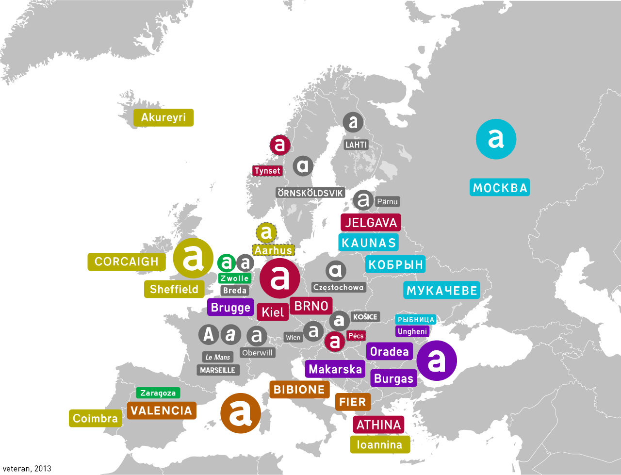
It’s really pissing me off that this map doesn’t include the typeface names
Anyway, here are the specs of the Finnish one in a pdf. It doesn’t seem to be named other than “typeface for road signs” or available as a font file
It’s really pissing me off that this map doesn’t include the typeface names
https://en.wikipedia.org/wiki/List_of_public_signage_typefaces
As I understood it the typeface is distributed this way because the roadsign makers will handle the letters as graphic elements, not text.
And I think someone actually unofficially adapted it as a font at some point.
It looks quite similar to DIN 1451 tbh
The capital letters seem to be quite similar, but the small letters look different to me.
Switzerland uses a variant of Frutiger typeface called ASTRA-Frutiger.
Switzerland likes to use for official purpose it’s nationaly developed typefaces.
It may be interesting to note that ASTRA-Frutiger replaced SNV typeface. But, SNV is still in use in other European countries like Belgium. SNV stand for Swiss Norm Association.
You would think they’d use Helvetica!
It’s used for a more sustainable transport type. SBB, the railway company uses Helvetica half bold for the station signs.
What are you trying to implicate with the colors?
Same colour (in adjacent counties) = same font
Gray is the exception. That was not obvious to me. Now, after you have mentioned it, I can see it, too.
IIRC the Netherlands uses the American one
Comic sans?
Highway Gothic
Sheffield
See? Not everyone in London hates The North.
This made me realize how dumb it is for sweden specifically to opt for all capitals, since we use so many letters with diacritics and it just ends up looking a bit silly
Although not my favourite, there is something I quite like about the Polish one
I really like the far right purple one! This is a really neat post ☺️
Thanks! I don’t actually know the name of that one tbh


