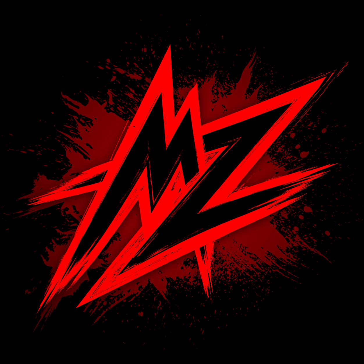

So blue for upvote, red for down and then an updated Sync logo.
I would like it to be opt-out because years of Sync for Reddit taught me “orange is upvote, violet is down vote and red is hide” when using swipe to vote/hide.
Yeah omg this is fucking with me so bad. I may as well let Discord update at this rate!
Inverted vote colors don’t even make sense! Up is uncreasing temperature i.e. warmer color.
deleted by creator
deleted by creator
Test
Those look slick!
Personally, I want a way to reverse the vote colours on the buttons…
I think this should be an option, but I’d also retain classic Sync up/down colours too for those who want to stay with it. I’m not sure I could ever get used to blue being an upvote, but I get why some might want it to.
As long as the blue/red colors are different enough from the current colors, that’d make it a less confusing change. Even if the colors don’t change, I think it’s best to match Lemmy’s setup.
no
Design language wise, it would make sense
I think they should. Would be nice if you could change the app icon and then the upvote/down vote colors and then give the option to reverse the upvote/down vote colors.
I would like to express my support for this proposal and cast my vote in favor of it.
It sounds reasonable, yes.
Yes
Yes please!
i don’t care but id love to be able to filter out image posts also I love you bb
Why not both?
Yes
Can you give a mockup of the logo with red?
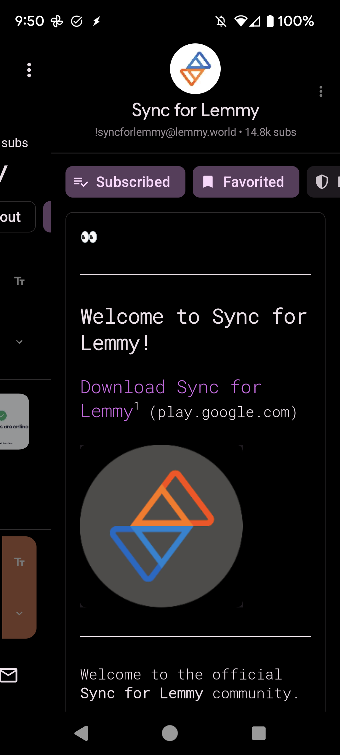
If you look at the “about” page for this community, the community avatar is blue=up and red=down, but a bit lower is the red=up and blue=down. That’s what I see, at least.
Edit:
This would be nice!