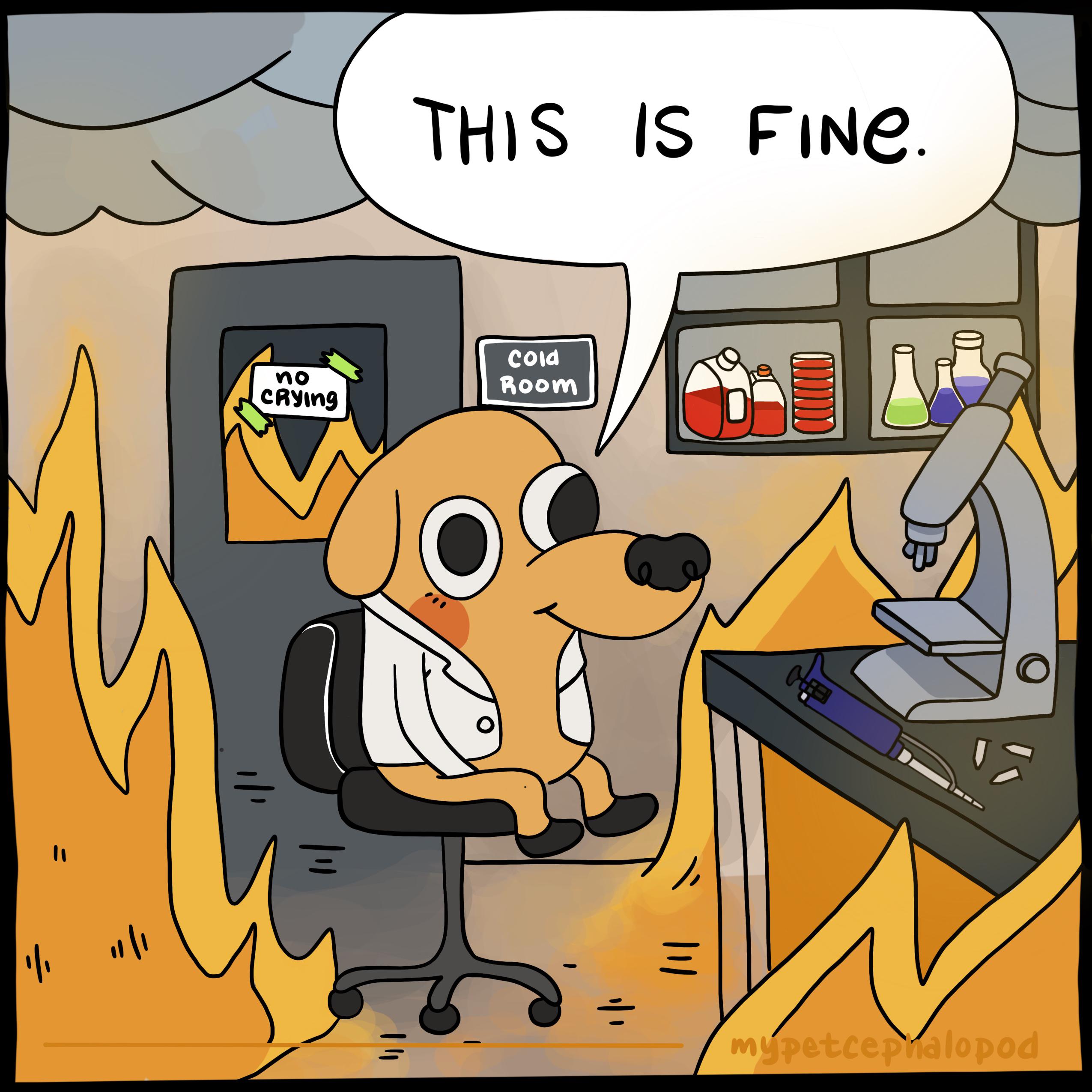
In English too, the colloquial name for tardigrades is “water bears” :D
- 0 Posts
- 54 Comments
I appreciate your point, but I still believe spelled-out numbers work better.
In prose, especially fiction writing, the ideal case is that the words themselves slide neatly out of the way and become invisible, leaving only a picture in the reader’s mind. Generally speaking, anything distracting is therefore counter-productive for fiction. Strange fonts and strange typesetting, while interesting, take the reader out of the prose. There’s a reason almost every fiction book you pick up from the shelf uses Garamond.
In an engineering context, remembering exactly “12 eggs, 6 toast” is probably the most important thing, and numeric digits assist in that. In fiction however it doesn’t matter if, by the next page, the reader has forgotten exactly how many eggs there were; the important aspect is to convey the sense of a large and chaotic family, and the overall impression is more important than the detail.
Thats why although the numbers are important for setting the scene, we really don’t want them to jump out and steal attention. We don’t want anything at all to have undue prominence, because the reader needs to process the paragraph as a cohesive whole, and see the scene, not the specific numbers.
Cooking is just applied chemistry, after all.
Context is everything, IMO.
In engineering work, numbers should always be digits. In prose, numbers should be spelled out.
Breakfast at the Thompson’s was a busy affair; 12 eggs and 6 rounds of toast for their 3 sets of boistrous twins.
Compared to
Breakfast at the Thompson’s was a busy affair; twelve eggs and six rounds of toast for their three sets of boistrous twins.
To me it’s pretty clear which of those reads better and more naturally as prose; digits really ‘jump out’ on the page, and while that is great for engineering texts, it is incongruent and distracting for prose.
Proper massive innit
Doctor Evil didn’t go to Evil Medical School for six years to be put in the section with no training, thank you very much!
Does a male’s eye look substantially different?
That’s what you get for being indecisive!

 29·17 days ago
Because then your browser would itself have to be a torrent client.
The way torrents download is fundamentally different from how a standard http download works, which is why they have a specialist implementation. Browsers dont want to bother bringing a whole load of new code and associated bugs into the browser to do a job which isn’t really connected with the browser’s main responsibility, which is browsing the web.
Just because torrents come from the web shouldn’t make it the browser’s responsibility to deal with them.

 33·1 month ago
It’s pretty ridiculous.
What happens if you go there and Sony have moved their EULA page and it just 404s? Does that mean there is no EULA at all and you can play without terms? Doubt Sony woild see it that way lol.
EULA should be displayed within the same context it is accepted.
Not seen Nagato in a while

 8·2 months ago
If a tree falls in the woods…
This may be a nonsense suggestion but is the game trying to activate the headphone mic?
If so this could be switching it to a different mode and cutting your headset audio quality in half.
EDIT: two other people suggested the same thing at the same time, never mind :)
Hexagons are the bestagons, after all
For you, maybe it was.
The point of good presentation and design cues is that they can make information instantly clear to almost everyone, no matter if their brain is the size of TON 618, or not.
The problem is the layout.
It needs horizontal dividing lines to show that the bodies are presented in pairs at the same scale.
When you first look at it, it seems like all six are in one picture at the same scale, then you start noticing things appearing twice, and think “hang on that’s not right” and work it out, but just two lines would have solved it immediately.
Design, people! Design!

 6·3 months ago
The teaser trailer looks like a high energy superhero romp that’s closer to Guardians of the Galaxy, than it is anything Star Trek.
And I just don’t like the idea that section 31 is made up of a bunch of oddballs and misfits with no discipline. Makes the movie more ‘exciting’ I guess, but really? Section 31 should move quietly in the shadows, not all brash and ballsy.
I’m sure they are hoping this style will boost revenue by appealing to a younger demographic, but it’s just totally the opposite of what I want from Star Trek.

 61·3 months ago
The number one thing I noticed after installing Linux on my old macbook was that the battery life was immediately halved.
I totally expected that to happen, though, because my previous experience had always been that power management on Linux was kinda terrible.
Time to try this out and see!


There’s also the option of electronic scales which are rechargeable via USB