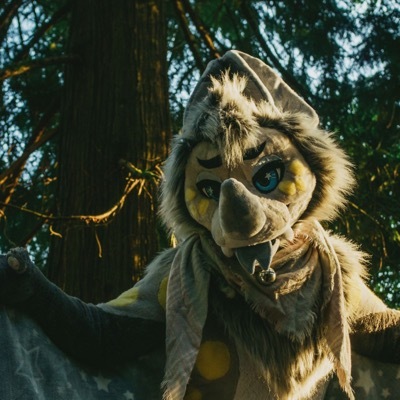
「fleece!」
Plush bat.
IT professional.
Hobbyist DJ, photographer, fitness creature, and unmotivated creative.
Lover of wolves. Local cryptid.
Naked forest Guardian.
All photos and other content posted is protected by CC-BY-NC-ND
- 0 Posts
- 1 Comment
Joined 1 year ago
Cake day: June 12th, 2023
You are not logged in. If you use a Fediverse account that is able to follow users, you can follow this user.


The only thing they need is a better app icon and I’ll be happy hahaha.
The app is SO GOOD but the icon looks like it was poorly cropped from a screenshot. Mlem is obviously going for somewhere between the apollo icon and Ivory icon and it makes the app just feel way more professional from the get-go