
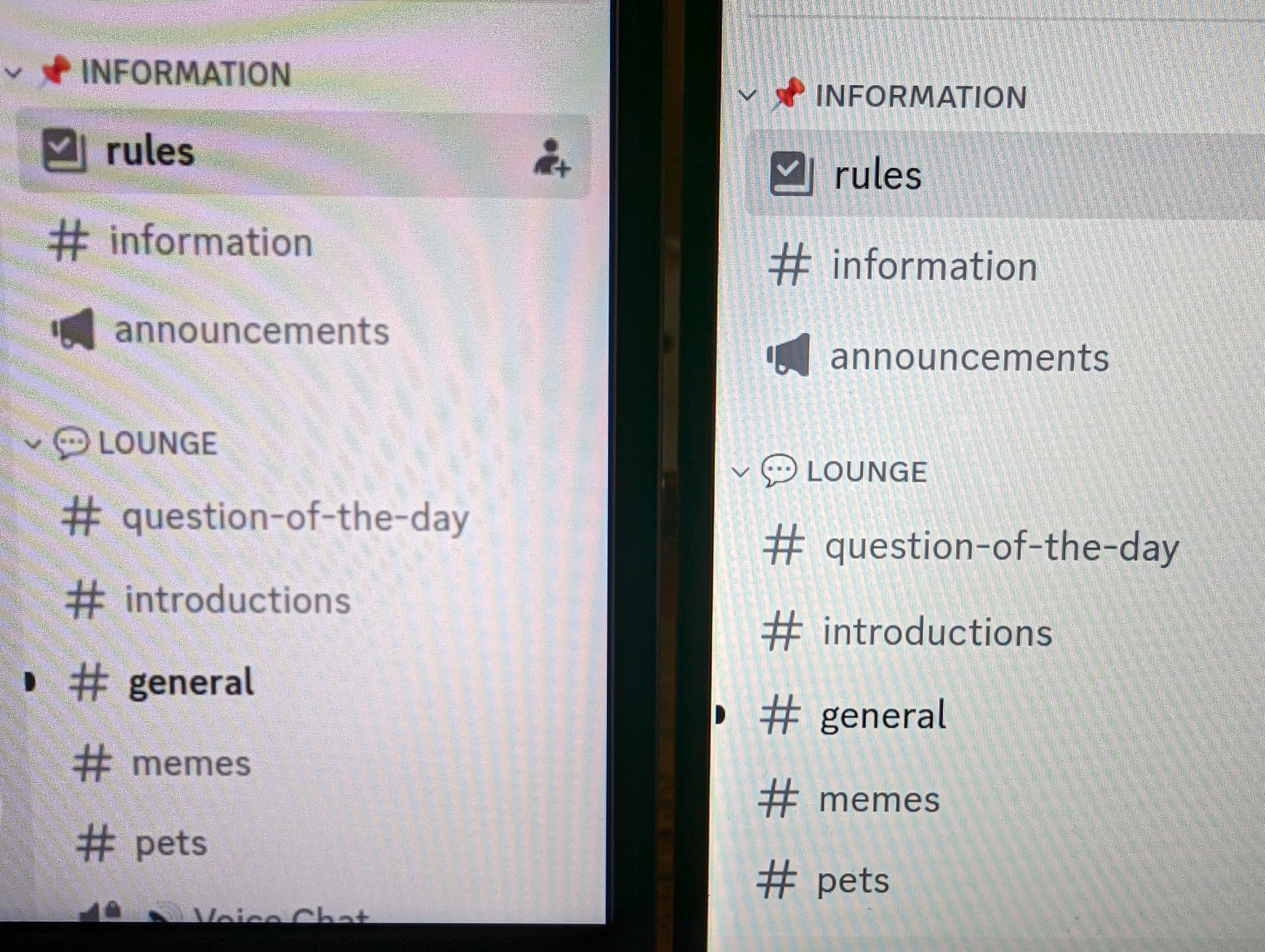
In 2024, with GNOME 45, Wayland, and 1.25 fractional scaling, regular DPI displays still look better than HiDPI displays. This is a photo of Discord on two laptops side by side.
The blurry one is the HiDPI display from Framework 13. The sharp one is a regular DPI display from Dell XPS 13. Both laptops.
The difference is even more stark in person.
Even the screenshots from the Framework are blurrier than the screen shots from the Dell.
You must log in or register to comment.
There’s no useful information to glean from this image other than the fact that we finally found someone who uses light mode on Discord.
I generally prefer light mode (I got lemmy on light mode for example) but certain apps like steam or discord just always were dark mode so I prefer them like that now lol
Neither of these look blurry to me but we’re not gonna be able to tell absolutely anything from these photos.
Agreed. I just see one that’s brighter and that makes it hard to not prefer it.
I can’t even see which one is good and which one is bad. They are just different.
Why are you using discord to compare and not literally any other app on the computer that actually has working scaling?
Maybe it’s the app he first noticed the difference in
“The blurry one” bro, which one is blurry or sharp. You never said left or right and assume we persieve things like you do
Non integer display scaling will always look like crap. Either set the scaling to 1 or 2 if you want it to look sharp. It’s better to increase font and icon sizes if they are too small.
Yeah, I stopped using display scaling and switched to this text scaling setting to get a similar result in a cleaner way,
$ gsettings set org.gnome.desktop.interface text-scaling-factor 1.25Non integer display scaling will always look like crap.
No it won’t, Windows has had this figured out for at least a decade
Apple, too. The 2012 MacBook Pro had a high DPI display, and everything scales normally even when dragging windows over to non-HiDPI external monitors.
That’s not even getting into the mobile OSes, which have to deal with nonstandard display sizes and resolutions all the time, across multiple settings for accessibility.
Either set the scaling to 1 or 2 if you want it to look sharp
I just switched the scale to 2x on the Framework and it also looks blurry. Actually, I wanna say the Framework display at 2x is worse than at 1.25x… I can see more of the fuzz around the fonts now. Framework at 2x on the left, Dell XPS 13 with the font size increased on the right.
It’s better to increase font and icon sizes if they are too small.
I haven’t tried this, but seems logical.
Coming from a Dell XPS 13 where everything Just Works ™ , I’m bummed Framework’s choice for display isn’t Linux compatible. I might just end up returning the Framework, the blurry fonts are messing with my eyes…
Framework’s choice for display isn’t Linux compatible.
They really should have set the option
Make_Discord_Blurry_On_Framework_Laptopsto"false"in the Linux kernel.If you don’t like it you can send me the laptop. I’ll dispose of it.
the yellowed colour temperature of the one on the right is more offensive than any blurring
Uh, I just see a not so high quality photo
Unless it changed recently, Gnome and fractional scaling factors do that. When you set it to 1.25, internally it does 2x then downscales that back to 1.25.
Even “real” fractional scaling in Plasma with Qt 6 is not much better. Text will look slightly sharper, but icons are still blurry. There is no way for them to look sharp with 1.25 scaling since they are drawn with a pixel grid in mind. Unless you invent some way to stretch svgs so that their individual elements and spaces between them retain their integer-ness while the scale of the whole image is fractional.
The only other solution is monitors with 300+ PPI where blurriness is simply not noticeable (that’s the way Apple went).
SVG is vector based, you can scale it endlessly. I don’t know how KDE does it, but the only thing I can imagine SVG giving you grief scaling is if the DE is caching bitmaps and scaling the cached versions instead of redrawing the icons.
Caching bitmaps for SVGs is sensible, not updating them when needed is madness. So probably it’s something else.
It is scalable but the icons are still drawn against the virtual pixel grid. If an icon is designed to be perfectly pixel-aligned when rasterized at a certain size, then rasterizing it at 1.25 of that size will cause small distortions if it contains small elements (such as 1 px width lines).
Did you enable subpixel font rendering and mess with the hinting?
This might be a bit of a hot take, but fractional scaling is generally not worth it, it almost always leads to some apps rendering things blurry and uses slightly more graphics resources. I’ve got a Framework 13 and I can say that just turning on the Large Text feature in Accessibility settings does the trick for me. This obviously doesn’t work for everyone’s needs, but if you’re like me and just want things to stay crisp but big enough to read, this could be a viable alternative.
deleted by creator
light mode Discord

I really wish the framework had an easy to replace screen the way the other components are. some sort of lock in place kind of thing.
This doesn’t even look that bad
Text and vector graphics should scale quite well. There are some cases where fractional scaling doesn’t work out, for example on borders that are 1 pixel wide @1x. Do you render them 2 pixels wide @1.5x, or 1 pixel? I have a Windows system for work and 1.5x scaling in Firefox renders buttons uneven, so the borders are thicker on some sides and thinner on others.
Fractional scaling isn’t the best solution, but even with most desktop displays transitioning from 2560x1440 to 3840x2160 we get fractional scaling. Sucks that 5120x2880 isn’t more mainstream for ~27" displays.


