
Not favourite-[term of mine] but [favourite term]-of mine obv. But grammar matters and you’re right
huppakee
lemm.ee migrant
- 1 Post
- 24 Comments
Joined 5 months ago
Cake day: June 7th, 2025
You are not logged in. If you use a Fediverse account that is able to follow users, you can follow this user.

 4·14 days ago
which should leave enough space for passing or oncoming bike traffic I think.
This would decide for 90% if I’m happy with these things driving around.
Fuck cars, yes - but vehicles exactly as wide as a standard width bike lane can fuck right off too.
 1·15 days ago
Why would a 17th century Ottoman cartographer choose not to draw Alhambra on one of those Granada hills. Was it lack of knowledge, lack of relevance or was there a political reason?
Thanks for sharing. 6 months training of which 30 hours driving an emergency vehicle. I have no clue how effective these classes are and how adequate people feel after 30 hours. Also maybe it’s more or less in other places, but either way: if innocent people die while going after guilty people, that’s incredibly sad and if that happens time and time again, something in the system is clearly broken.
I once read US police get only get a few months training, if true i would not be surprised they don’t drive safer/better as any other guy.
 3·17 days ago
I’ve never heard anyone say newpipe is good
Google is a
companymulti-billion dollar corporation.CompaniesMulti-billion dollar corporations do not care about you. You are not a person, you are a number.(Well ok, there is plenty of small business who also don’t care about you, that’s not my point).
You are the one who said “Instead, most Canadian cities tax housing.” is an inaccurate assumption while everything you say agrees with this lol.
But then the fee would rise equally in big cities as it would in small towns, but they’re all over the place. One increases where the other decreases etc.
That explanation doesn’t explain why these fees differ so much from place, considering the fee is per housing unit. Higher density can mean building and maintaining infrastructure is more expensive but not by factor 10 or 20. Also these costs rise rather equally across the country, while this graph clearly shows a huge difference between cities there as well.
Edit: meant to write a comment to another comment, removed this ‘copy’.
 15·19 days ago
Also left unanswered: was this one big mistake or a hundred small ones?
I can’t remember seeing a physical poster made by them, nor a video campaign. I think they’ve changed their approach over the years because when I hear of or from them it is either because a local chapter object or suggest a certain design of a very specific place like a crossing or a new road or because they’ve lobbying some very specific change in a law or a guideline. Not sure what caused that change. Maybe our country already believe cars suck? Not sure, but a lot of people who drive do prefer to cycle if the distance allows it, especially if they’re travelling inside a town.
I’ve seen versions of this that make more sense then this poster as well, reason for sharing it is mainly because it’s age shows that the concept of space for people (vs space for machines) has been relevant for a long time now.
Edit: Also notice how much this street look like some streets in some countries, but look nothing like inner-city streets in the Netherlands. Roads without bike lanes are extremely uncommon nowadays.
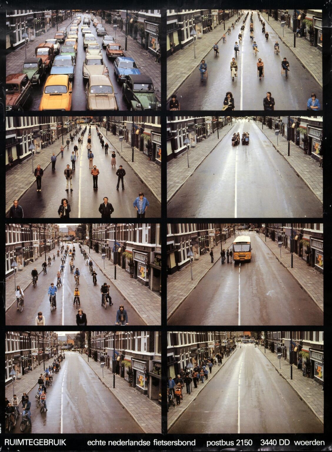
Another one i like:
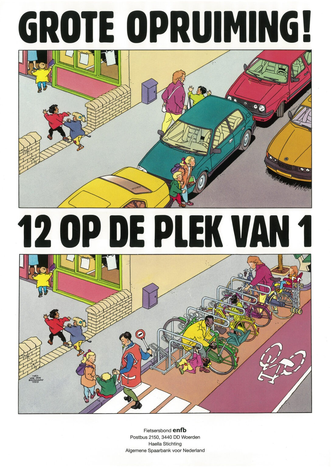
Big clearance: 12 instead of 1.
My money is on that there was no woman, no baby, no placenta, no Tylenol. Just gobbling.

Depends on the pov though, the donuts hole is very different compared to the bats hole.
I agree, even the less obvious ones as having a good attitude or being on times arent things that requires effort (like whoever scrawled on the picture scrawled).