You must log in or register to comment.
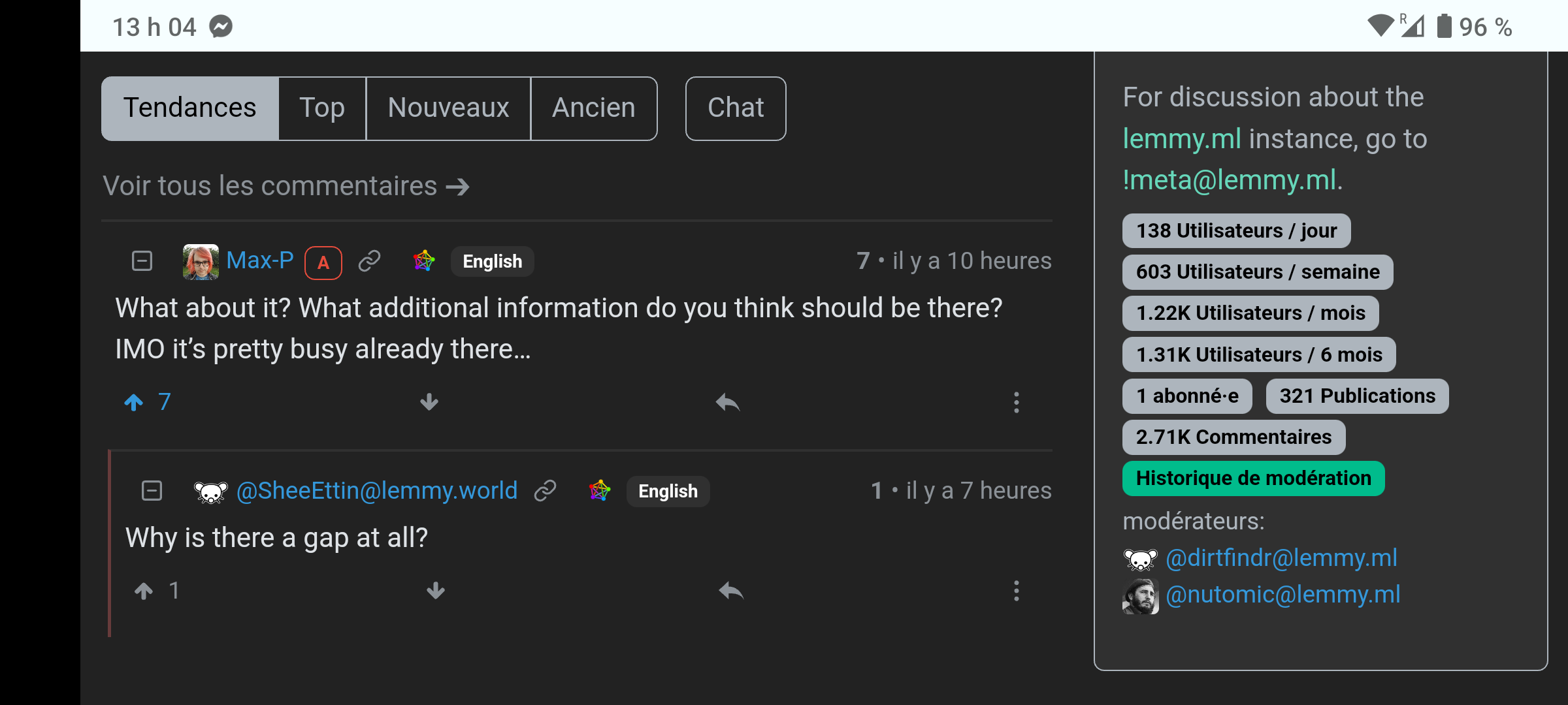
What about it? What additional information do you think should be there? IMO it’s pretty busy already there…
Why is there a gap at all?
Because the vote count and timestamp is aligned to the right, while the username, tags and links are left aligned.
Maybe it’s clearer in landscape orientation:

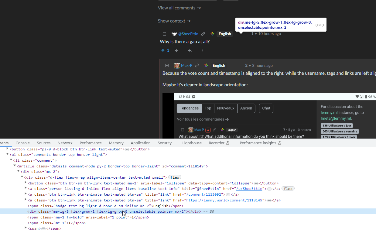
No, there’s an empty div.


