
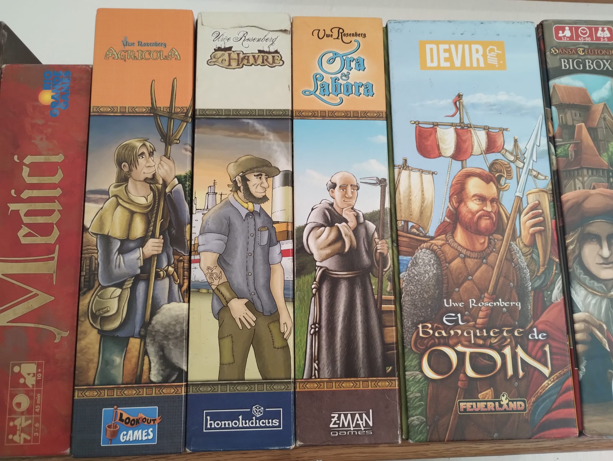
I have four Uwe Rosenberg games. Three of those follow a similar format: game title on top, then a line, then some dude, another line, publisher logo. But Feast For Odin had to go and be all creative and unique.
You must log in or register to comment.
and all the dudes are facing in the same direction, what are they looking at? Or are they waiting in a queue?
The first 3 are designed by Clemens Franz, A Feast for Odin was designed by Dennis Lohhausen. Dunno if that applies to the box design though, but clearly a different visual style.

